If you are like me and love designing your website on your own, you probably faced the issue of choosing a color schema for your website. I used to use some websites like Adobe Color to generate a color schema for my website. However, I always end up not liking the result, because it is hard to find the right matching of colors for each use case: website background, UI elements background, UI element properties' colors, borders, and more. I am not even talking about accessibility and dark mode. I am happy to share that I found a solution for all of my color-related problems: Radix Colors.
 Radix Colors: truly gorgeous, accessible color system for your website
Features of Radix colors system
Radix Colors is a very simple yet feature-rich color system. The colors in Radix are not designed to be customized, because they are already hand-picked to be harmonious and well-balanced. These are some features of Radix Colors:
- The accessibility is baked in
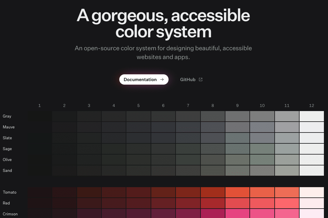
- It has a rich set of different color sets(including rich colors and grayscale)
- All the colors automatically support dark mode
- The documentation is very clear and gives guidance on which color scale to use for each use case
Let me show you how you could build your color palette for your website.
How to compose a color palette for your website
Designing is not one of my strengths. The reason I like Radix Colors is that I don't need to know much about color theory and other important aspects like accessibility and dark mode. Let me go through the steps, to set up a color palette for your website.
Step 1: choose brand colors for your website
If you don't have a brand color for your website, choose one or more of the colors that Radix Colors provides. Use this little tool that I built especially for this post, to choose the colors that you like:
Choose your color. Current: tomato
White foreground colors
Black foreground colors
Example of the usage
Note 1: The background used for the button is not the only option, there are 12 steps for each color, and you can use whichever suits best for your use case.
Note 2: This page from Radix Colors documentation contains all the possible scales(dark and light modes), while the example above is only for dark mode.
Step 2: choose a grayscale colors
Almost every website needs a grayscale color, for things like text, borders, and backgrounds. Also, they are perfect as a contrast text color for headings. Here is another color picker to choose grayscale colors.
Choose your color. Current: gray
Grayscale colors
Example of the usage
If you are struggling to choose the right combination, take a look at Natural pairing section of the Radix Colors website. They give pretty good combinations to select from.
Step 3: include your selected colors in your code
First of all, you need to install the @radix-ui/colors NPM package. You can do so by using one of these commands:
npm install @radix-ui/colors
// or
yarn add @radix-ui/colors
Then you need to import them either into your CSS(using @import) or if you use CSS framework into its theme as color objects. Here is an example with styled-components:
import { blue, indigo, gray } from '@radix-ui/colors';
import styled, { ThemeProvider } from 'styled-components';

const theme = {
  colors: {
    ...blue,
    ...indigo,
    ...gray,
    // any other colors you want to add
  }
};

export default function App() {
  return (
    <ThemeProvider theme={theme}>
      <YourApp />
    </ThemeProvider>
  );
}
I personally import them using the link tag in the head of my HTML and then reference them using CSS variables. Since my website is built with the Remix framework, I can do it this way:
// in my root.tsx

import indigoDark from '@radix-ui/colors/indigoDark.css';
import mauveDark from '@radix-ui/colors/mauveDark.css';

export const links: LinksFunction = () => {

  return [
    {
      rel: 'stylesheet', href: mauveDark,
    },
    {
      rel: 'stylesheet', href: indigoDark,
    },
    // and more colors that I need
  ]
}
Step 4: use the colors to your advantage
That is it. You can now use them when building any UI element. I have Understanding the scale page bookmarked, whenever I need to think of colors for new UI components. It explains very well with examples of how to use each step of color for each use case. I built a callout component that you saw on this page using the same guide.
If you find this article helpful take a moment to share it with others on Twitter. If you don't want to miss new posts like this, make sure to subscribe to my email list at the bottom of the page.